Ralphitness LLCBrand identity system
Calm, humble, a little dry.
The rules for how Ralph Llenas Ruiz and Ralphitness look and sound. Short on purpose. If a decision isn’t covered here, choose the quieter option.
01Foundation
The anti-guru.
Trading performance coaching for people who already know what to do and would like to actually do it.
Stop creating rules about what the market will do. Create rules about what you will do.
That line from MAYBE: A Book About Day Trading is the whole brand. The trader is part of the system: sleep, stress, baseline, no-trade days. Everything we publish should make that idea clearer, and nothing should promise a result.
Ralph Llenas Ruiz
The person. Leads every header, byline, and introduction. People hire a coach, not an LLC.
Ralphitness
The company and the domain printed in the book. Appears as the logo and in legal lines. Never explained, never apologised for.
MAYBE
The book. Always italic, always capitals. It is the front door for most visitors.
Calm
No urgency, no countdowns, no exclamation marks. The market supplies enough adrenaline.
Humble
Trading since 2006, no finance background. Say what is known, admit what isn’t.
Dry
A little wit, used sparingly. The joke is never on the reader.
02Logo
Same mark, new colors.
The winged mark and wordmark stay. The lime and grey are retired in favor of the new palette. Select a file name to download the PNG.

Primaryprimary.png

On indigoon-indigo.png
On oliveon-olive.png

Mono indigomono-indigo.png

Mono olivemono-olive.png

Mono reversedmono-powder.png
Use
- Primary on Baby Powder or Cream.
- Reversed versions on Indigo or Black Olive only.
- Clear space on all sides equal to the height of the “R”.
- Minimum width 140px on screen, 35mm in print.
- In site headers, his name leads and the logo sits in the footer.
Avoid
- The old lime and grey version.
- The “I AM, the miracle.” tagline.
- Placing the logo over photographs or charts.
- Stretching, outlining, shadows, or gradients.
- The two-color logo on Mikado Yellow. Use mono olive.
Digital only. These PNG files are approved for screen use. A vector redraw will be needed if the logo is ever printed.
03Color
Five colors, used unevenly.
Mostly paper and ink. Indigo carries the brand. Yellow is punctuation. Select a swatch to copy its hex value.
- Indigo Dye
#054683· RGB 5 70 131- Brand color. Headlines, links, primary buttons, dark sections.
- Black Olive
#322F20· RGB 50 47 32- Ink. All body text. Replaces pure black everywhere.
- Mikado Yellow
#F2BC00· RGB 242 188 0- Accent. Rules, markers, focus rings, the mark on dark. Never text on light.
- Cream
#F4FEC1· RGB 244 254 193- Highlight surface. The book banner, pull quotes, one panel per screen.
- Baby Powder
#FFFFFC· RGB 255 255 252- Paper. The default page background.
Proportion
Paper 62 · Ink 18 · Indigo 12 · Cream 5 · Yellow 3. If a page looks loud, there is too much yellow.
Approved pairings
| Sample | Text on background | Contrast | Use for |
|---|---|---|---|
| Aa | Olive on Powder | 13.4 : 1 | All text |
| Aa | Olive on Cream | 12.7 : 1 | All text |
| Aa | Indigo on Powder | 9.5 : 1 | All text, links |
| Aa | Powder on Indigo | 9.5 : 1 | All text, buttons |
| Aa | Cream on Indigo | 9.0 : 1 | All text |
| Aa | Olive on Yellow | 7.7 : 1 | Labels, one button |
| Aa | Yellow on Indigo | 5.4 : 1 | Headlines, the mark |
| Aa | Yellow on Powder or Cream | 1.7 : 1 | Never for text |
| Aa | Indigo with Olive | 1.4 : 1 | Never adjacent as text |
Ratios follow WCAG 2.1. Body text needs 4.5 : 1 or better.
04Typography
A serif that reads, a sans that disappears.
Both families are open source on Google Fonts, so they cost nothing and work in WordPress, GoHighLevel, and print.
Fraunces 400
56–84px / 1.05
Fraunces 400
30–44px / 1.12
Fraunces 500
22px / 1.3
Fraunces 400
22px / 1.5
Inter 400
17–18px / 1.65
Inter 500
12px caps, +0.14em
Inter 500
15px
Use
- Sentence case for every headline and button.
- Lines of 60 to 70 characters for body text.
- Italics for MAYBE and for emphasis.
- Left-aligned text.
Avoid
- ALL CAPS HEADLINES.
- Bold serif headlines.
- Centered paragraphs.
- A third typeface, including script fonts.
05Voice
Say less. Mean it.
Write like a person who has been wrong in public and survived. Short sentences. Specifics over adjectives. No promises.
Sounds like us
- “If it isn’t a fit, you’ll hear that from me first.”
- “Trading since 2006. No finance background. Still here.”
- “A rule about hours slept is easier to follow than a rule about staying disciplined.”
- “Twenty minutes, no pitch.”
Does not
- “Unlock your full trading potential!”
- “The secret the pros don’t want you to know.”
- “Only 3 spots left this month.”
- “Transform your mindset and crush the markets.”
| Instead of | Write | Why |
|---|---|---|
| therapy, clinical, treatment | coaching, sessions, work | Ralph is a student of psychology, not a licensed clinician. |
| profits, income, returns, winning | discipline, process, execution | No income claims, ever. |
| strategy, setups, signals | your rules about you | We do not give trade recommendations. |
| guru, expert, master | coach, author | The anti-guru cannot call himself one. |
| guaranteed, proven, secret | maybe | It is the title of the book. |
06Imagery
One photograph. Then words.
Use
- One professional headshot per page, natural light, plain background.
- The book cover, flat, on Baby Powder or Cream.
- Whitespace as the main visual element.
- Photographs Ralph owns or has licensed in writing.
Avoid
- P&L screenshots and account balances.
- Green candles, charts, tickers, multi-monitor desks.
- Cars, watches, beaches, laptops by pools.
- Arms-crossed “superhero” portraits.
- Stock photos of people pointing at screens.
- Old fitness and chronic-pain imagery.
Photo library
The current approved set. One photograph of Ralph per page. Session photos support the coaching section only.
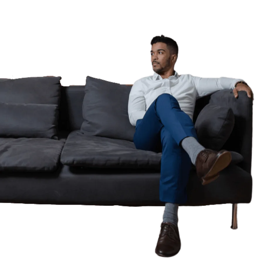



Not in the set: stock-style lifestyle photos of people who are not clients, such as a model laughing on a phone. They read as advertising and their licence is unconfirmed.
07Components
The few parts we need.
Buttons
One primary button per screen. Labels say what happens next.
Primary indigo. Secondary outline. Yellow is reserved for the single book purchase button. Text links for everything else.
Book banner
On dark
Forms and booking
Forms, calendar booking, and email run through GoHighLevel and are embedded in the site. Style the embed to match: Baby Powder fields, 1px olive hairline border, 2px radius, indigo submit button, Inter throughout. No pop-ups and no exit-intent offers.
08Compliance
What we never publish.
- No income claims. No figures, percentages, win rates, or account screenshots, including Ralph’s own.
- No trade recommendations. No tickers, entries, or market calls in any channel.
- No therapy or clinical language for current services.
- Testimonials speak to discipline only. Real clients, written permission on file, no results language. None are published until those exist.
- Every page carries the risk disclaimer adapted from the copyright page of MAYBE.
- No manufactured urgency. No countdown timers, fake scarcity, or limited-time pricing.
09Launch standard
Nothing goes live without these.
Every Ralphitness web property is checked against this list before launch.
- Terms and conditions
- Privacy policy
- Refund policy and consent form
- Cookie policy
- Third-party embeds checked
- Analytics and necessary data connected
- Clear call to action
- FAQ, if needed
- robots.txt and sitemap.xml
- Custom 404 page
- Meta titles and descriptions
- Favicon
- Canonical URLs
- Accessibility pass
- Clear button labels
- All formats tested
- Mobile functionality checked
- No fake reviews
- Image copyrights checked
- Other risks flagged